Reinventing Search: A UX Redesign for Tre.se
Role
UX Research, Wireframing, Prototyping & Guidelines
Timeline
June – August
Platform
Algolia Engine
Deliverables
UX Strategy, Prototyping, Accessibility Guidelines
Executive Summary
The Problem
Static, text-heavy search bar leading to high bounce rates and support overhead.
The Solution
Data-driven redesign using the Algolia engine with instant visual results.
The Result
Transformed search into a primary conversion driver and discovery engine.
How a research-led approach transformed a static search bar into a high-conversion discovery engine.
The Challenge
The legacy search on tre.se needed a complete functional overhaul to align with user expectations and technical constraints. My goal was to move from a basic search to a sophisticated tool using Algolia to drive engagement.
My Role
UX Research, Wireframing, Prototyping & Guidelines. I integrated feedback from SEO, CRO, and Frontend teams to create an experience that isn't just a tool, but a conversion driver.
01. Deep Dive Research
I didn’t start with sketches; I started with data.
Quantitative Insights
41% search for products, while a massive 59% are looking for support articles.
User Personas
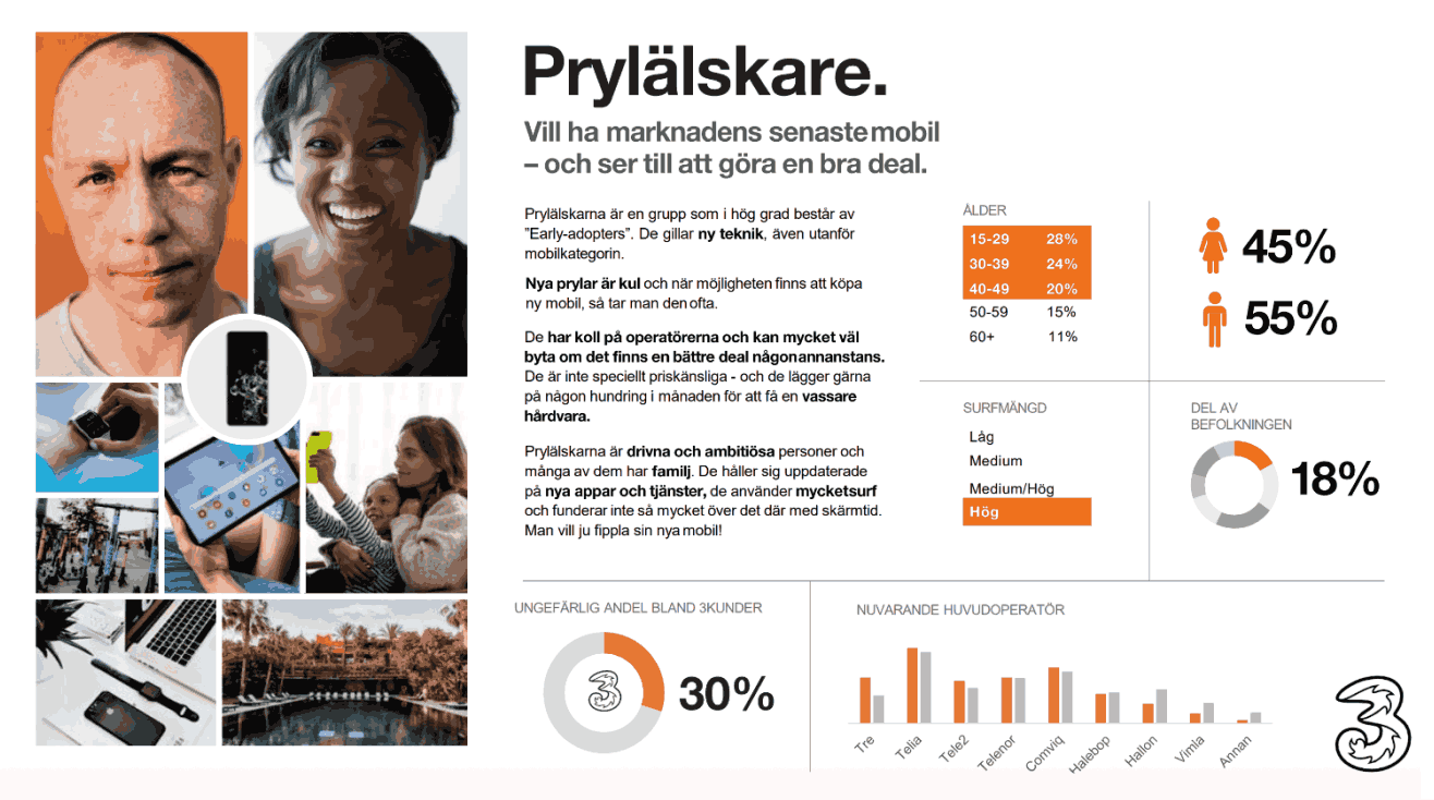
Designed for Prylälskare (Deals) and Livspusslare (Efficiency) personas.
Benchmarking
Analyzed Apple and Amazon for best-in-class e-commerce search patterns.
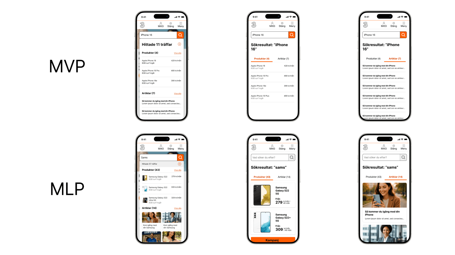
02. Strategic Framework: SMVP vs. MLP
To balance developer resources with user delight, I categorized features into two tiers:
SMVP: Core Stability
Ensuring foundational UX—filters, speed, and accuracy—are stable and functional.
MLP: The "Wow" Factor
Live pricing, article grids, and rich imagery to exceed customer expectations.
03. Design & Iteration
I utilized Guerilla Testing to validate our prototypes, leading to a crucial realization: The Aesthetic-Usability Effect. Users perceived the interface as more usable simply because it was more visually professional.
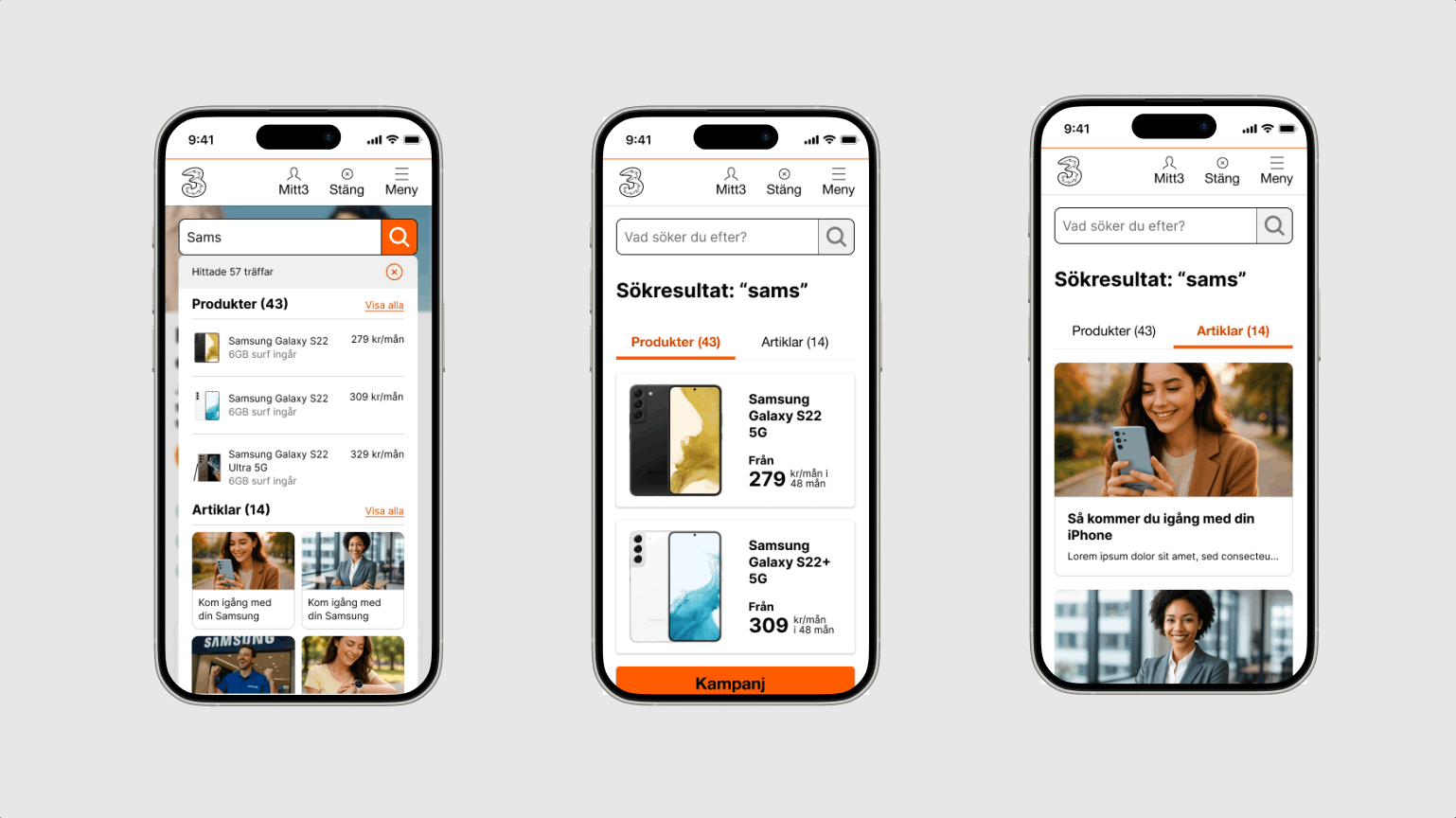
Instant Results
Results appear after just 2–3 characters, drastically reducing interaction friction.
Visual Hierarchy
Cleaned up "dead white space" with a two-grid layout for products and articles.
Smart "No Results"
Added CTAs for popular pages and helpful search tips instead of a dead end.
04. Accessibility Audit (WCAG)
Search must be for everyone. The design was audited against WCAG standards, ensuring:
- A text contrast ratio of 4.5:1.
- Seamless keyboard and VoiceOver navigation.
- Resizable content up to 200% with no loss of functionality.
The Result
By democratizing the design process, we created a search experience that acts as a primary conversion driver.
What's Next?
Assisting the eCom team in aligning findings with the live API to ensure a pixel-perfect rollout.