Follow My Order
Role
Product Design (UX/UI)
Timeline
1 Month
Platform
Web (Desktop & Mobile, Mitt3)
Deliverables
Component Redesign, UX Refactoring
Executive Summary
The Problem
Fragmented tracking riddled with legacy bugs and disjointed information silos.
The Solution
Consolidated single-page view with 1:1 backend API status synchronization.
The Result
Drove +707% monthly unique page views and slashed customer support friction.
A completely redesigned order tracking experience that removed bugs, mapped directly to backend APIs, and centralized all information to optimize conversion and user satisfaction.
The Challenge
The old order status solution had plenty of bugs and grouped items based on statuses, causing confusion. It also lacked alignment with our BackEnd API and spread trackable information across multiple pages, adding unnecessary friction.
My Role
As Product Designer at Mitt3, I led the UX/UI overhaul. This involved removing duplicate information, mapping unique statuses per item, collapsing the journey onto a single page, and completely rebuilding the component for both desktop and mobile.
Business Impact
Monthly Unique Page Views
+707%
By simplifying the UI and ensuring every item displayed its unique status mapped perfectly to the backend API, engagement skyrocketed, proving the value of a single-page consolidated view.
01. The Origin
What began as a modest BackEnd-API requirement—implementing return statuses—evolved into an autonomous redesign initiative. By collaborating directly with developers, I identified significant UX gaps that could be bridged without top-down mandates.
02. Technical Discovery
When auditng the legacy Figma files, I discovered a history of technical constraints that had frustrated previous designers. To pick the low-hanging fruit, I focused on:
- Developer Insights: Interviewing FrontEnders to understand the "why" behind the existing brittle architecture.
- Constraint Mapping: Identifying which API limitations were fixed and which could be optimized via UI logic.
03. Developer-Centric Methodology
Given the complexity of the "Tre" API, I placed the developers at the center of the design process. Our goal was to maximize UX value with minimal development overhead:
- Leveraging existing components to save time.
- Early involvement of copywriters for status clarity.
- Synchronizing UI states with real-time API truths.
- Reducing fragmented journeys into single-page views.
04. User Validation
Validated through seven "Think-Aloud" interviews. While the initial redesign was intuitive, users struggled with technical jargon. After a collaborative rewrite of the statuses with our copywriter, the design achieved a flawless task completion rate.
Visual Evolution
Behind the Redesign
Unique Item Statuses
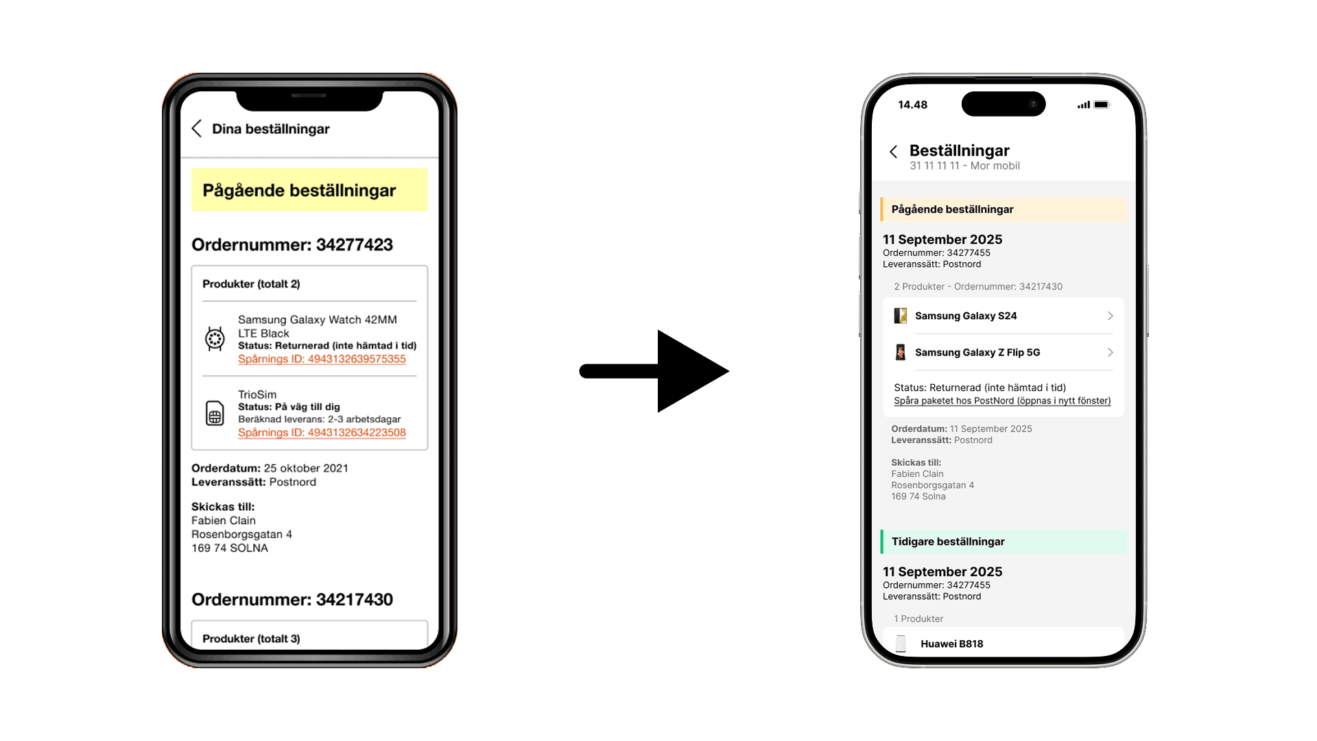
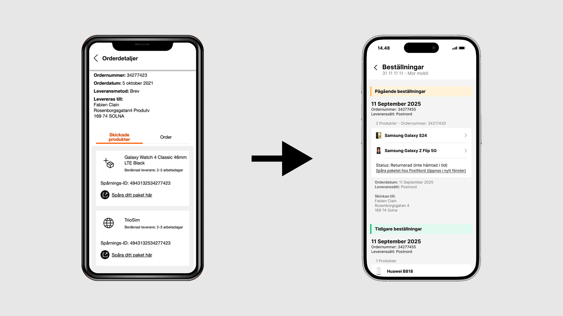
Instead of grouping items depending on generic statuses, each item now displays its own unique status, eliminating ambiguity for the user.
API Synchronization
The new UI logic is explicitly mapped towards our BackEnd API, ensuring that what the user sees is always perfectly in sync with our system truth, eliminating legacy bugs.
Single Page Conversion
Conversion was optimized by taking a fragmented journey and moving everything to one single page, drastically reducing drop-off rates.
Zero Duplication
Thoroughly audited the content to remove duplicate and unnecessary information, resulting in a cleaner, more scannable desktop and mobile component.
05. The Second Iteration: Cross-Border Synergy
As we merged our solution with Tre Denmark, we received a massive boost in developer power. This collaboration allowed us to update tracking components visually and introduce intelligent native package clustering.
UI & Component Upgrades
With expanded bandwidth, I overhauled the UI logic to reduce visual noise by bundling shipments:
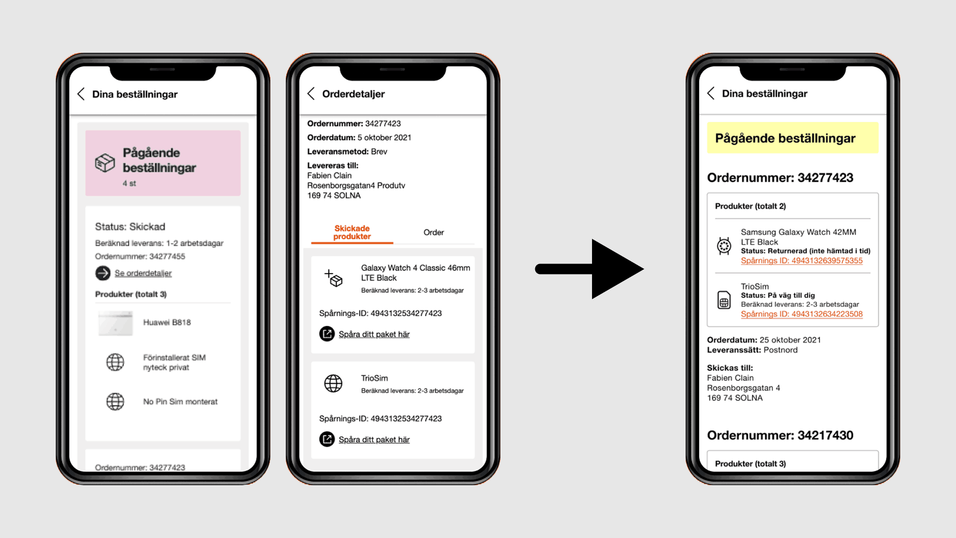
The First Iteration (Individual Statuses)
Every single item (e.g., phone, case, SIM card) received its own distinct tracking card and status in the UI, even if they were physically shipped in the exact same package.
The Second Iteration (Tracking ID Clustering)
Thanks to the expanded team, I introduced intelligent UI grouping. If multiple items share the exact same Tracking ID number from the carrier, they are now dynamically clustered together into a single delivery block.