Apple Services
Role
UX Designer
Timeline
1 Month (UX) / 4 Months (Dev)
Platform
Web & Mobile
Deliverables
User Research, UX, Visual Design
Executive Summary
The Problem
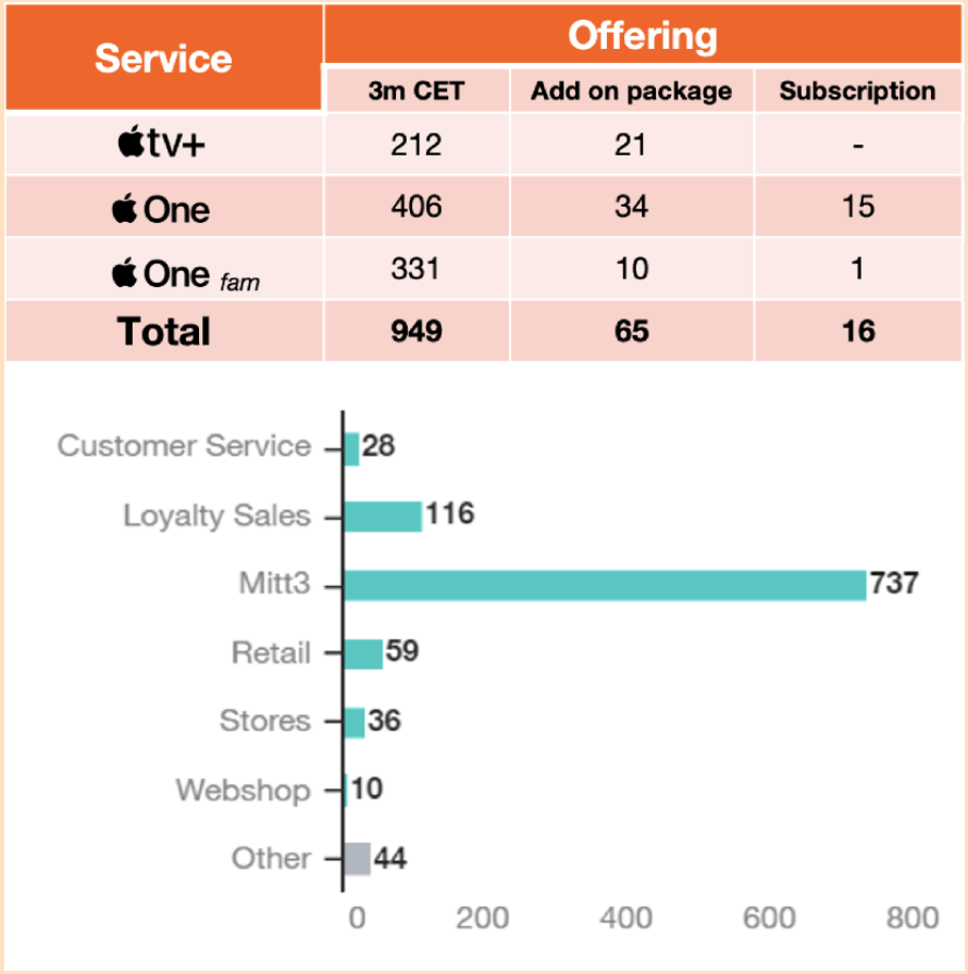
Users were unaware of digital services during devices purchase, resulting in low attach rates.
The Solution
Shifted strategy to "Trial-First" activation directly within the cross-sale journey.
The Result
Reduced activation friction and secured rigorous co-branding approval from Apple.
We enabled customers to seamlessly acquire different types of Apple services using Tre as a vendor, overcoming extreme secrecy, legacy backend limits, and tight deadlines.
The Challenge
The project operated under extreme secrecy with a tight five-month total deadline (one month strictly for UX, four months for development). We had to commit to highly demanding KPIs and ensure the experience was fully approved and co-branded by both Apple and Tre, all while working within the constraints of limited legacy backend systems.
My Role
User Research, UX, and Visual Design. I was involved from the beginning, co-designing the first iteration where I took full ownership of the logged-in state while a colleague handled the logged-out state. In the second iteration, I completely redesigned the logged-out state.
My Solutions
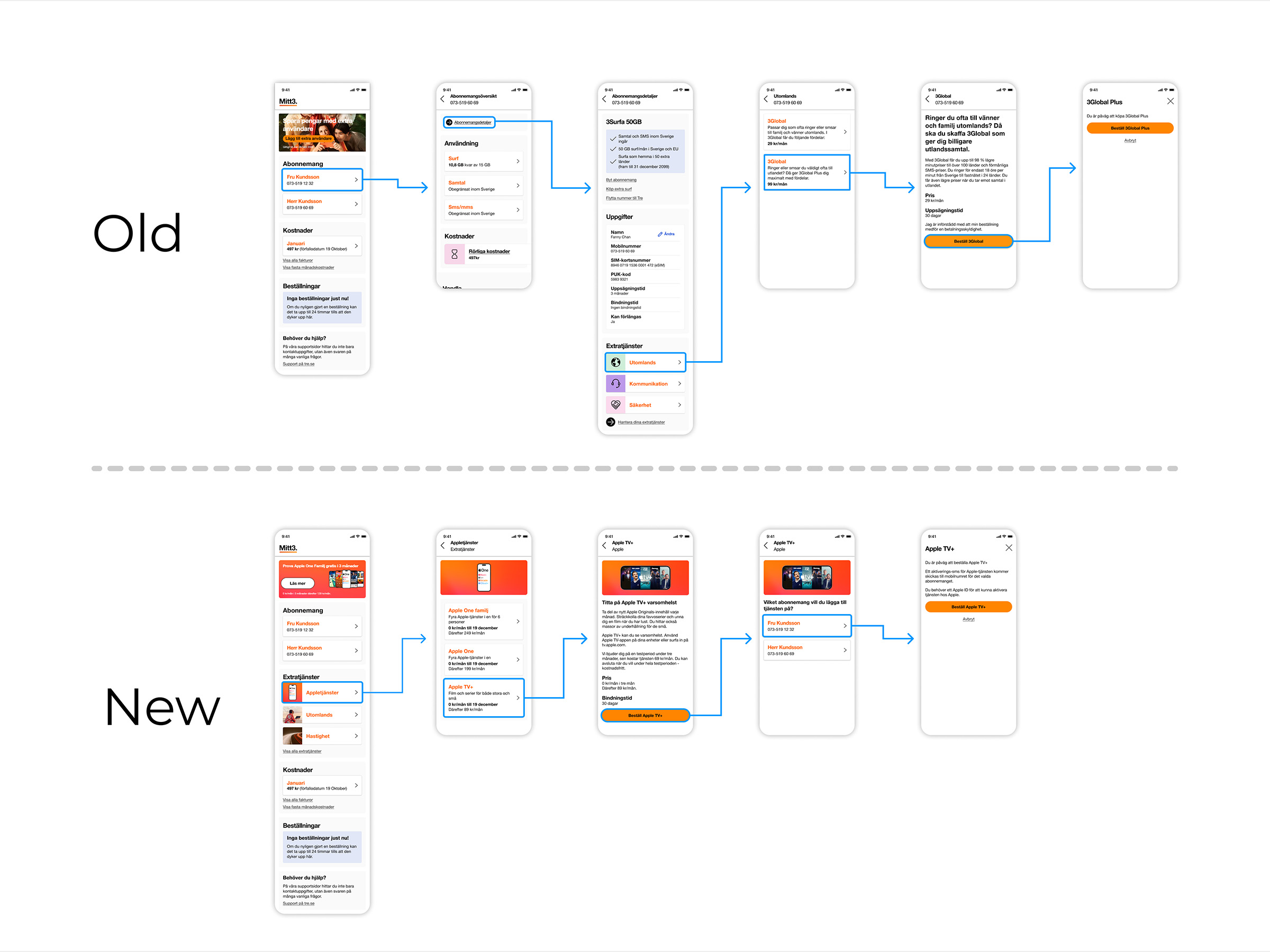
New Validation Logic
Designed entirely new logic for navigation and validation when users purchase extra services to ensure a seamless flow.
Purchase Deeplinks
Enabled deep-linking directly for purchases, allowing SMS and email campaigns to lead straight to the checkout flow.
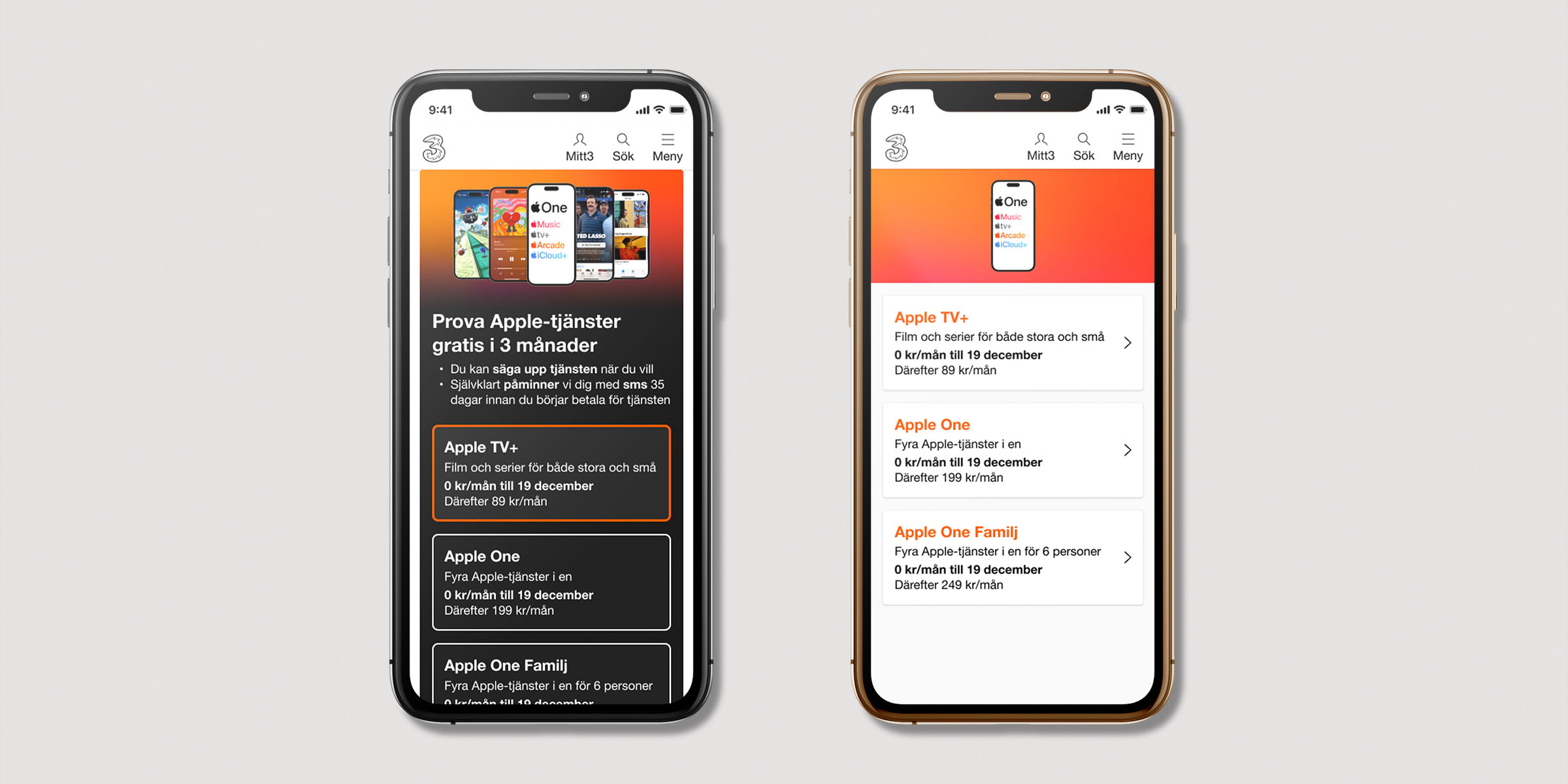
Global Addon Entry
Added clear entry points to the addons directly from the top banner to complement and highlight the newly available services.
Dual Brand Compliance
Ensured the entire flow met rigorous UI/UX standards, successfully gaining approval from both Tre and Apple stakeholders despite limited backend architectures.
Focusing on Retention
By presenting Apple Services not as standalone products but as enhancements to the user's new device investment, we saw improved trial conversion and long-term retention.
The First Iteration: KPI Shock
After the first iteration was finished and the KPIs were presented, it became clear that the logged-in state performed significantly better than the logged-out state. Stakeholders expected both parts to perform equally, but the data told a different story.
Part Two: The Second Iteration
Part Two
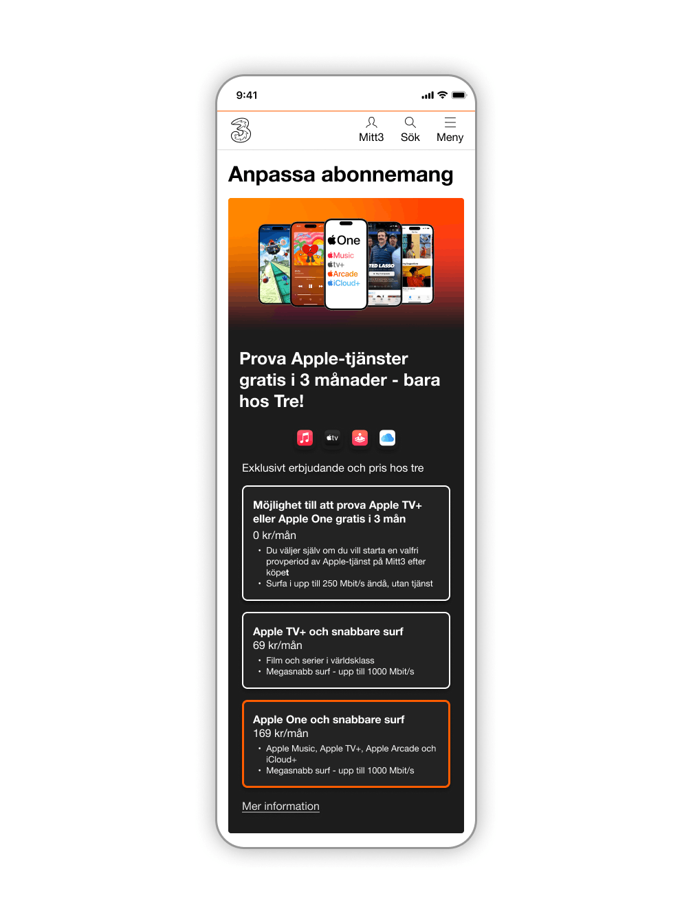
I took over the e-commerce UX design after my colleague left. My primary hypothesis was that we had made a fundamental error by trying to sell users the most premium service directly in the mobile purchase page.
According to user tests and comments in Hotjar, customers were barely aware of what these Apple Services were. Users typically entered this flow purely to purchase a new phone and perhaps update their subscription, not to shop for expensive digital add-ons.
A Different Approach
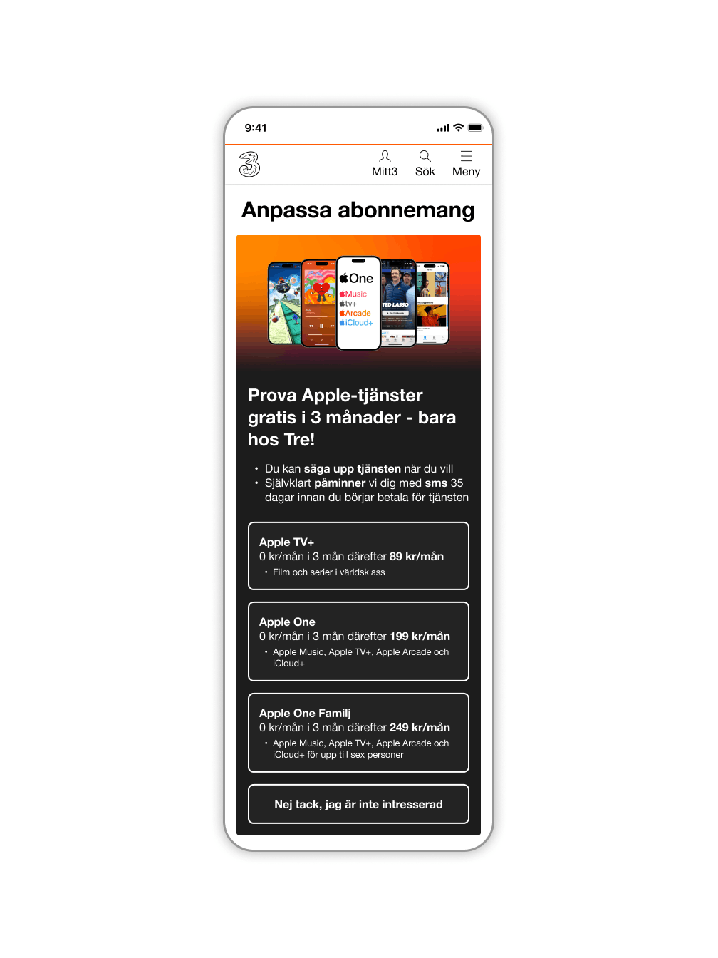
Because only a tiny percentage of customers converted to premium services on this particular page, I suggested that it was smarter to use a different funnel. Instead of trying to sell the highest-tier service to unaware customers, we should sell trial services on the webshop. Letting users "try before they buy" would generate significantly more revenue over time.
Refining the Customer Journey
With trial services now being offered on the cross-sale page, the UX needed to make acquiring these trials frictionless.
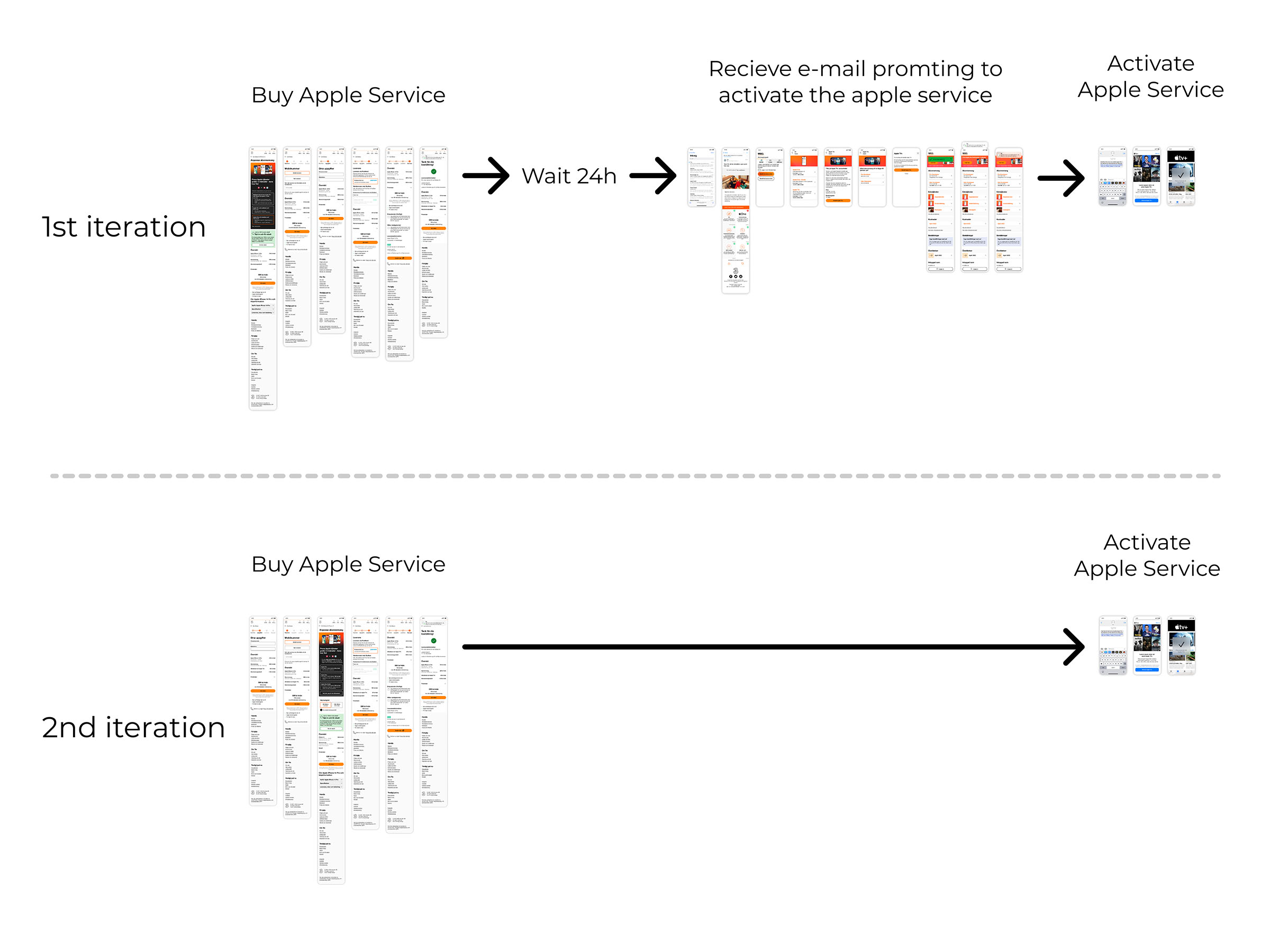
The Old Solution
The New Solution
I completely overhauled this so users could buy and activate the service immediately directly within the cross-sale page, removing all sequential friction completely.
Visual Evolution